Digital Marketing, UX Design and Research, Brand Identity and Strategy
Figma and Google Analytics
ENHANCING VANECK’S DIGITAL CONTENT EXPERIENCE
01 PROJECT GOALS
︎︎︎ Increase VanEck’s brand awareness and digital media presence.
︎︎︎ Improve the website UI and develop design solutions to enhance user experience.
︎︎︎ Boost conversion rates and lower exit rates by making long-form, heavy content more digestable.
02 MAPPING OUT USER JOURNEY AND PAIN POINTS

Understanding the user journey helped us identify pain points and opportunities of their interactions with the content and brand.
03 DIGITAL MEDIA STRATEGY
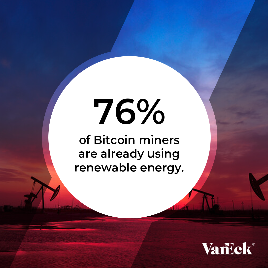
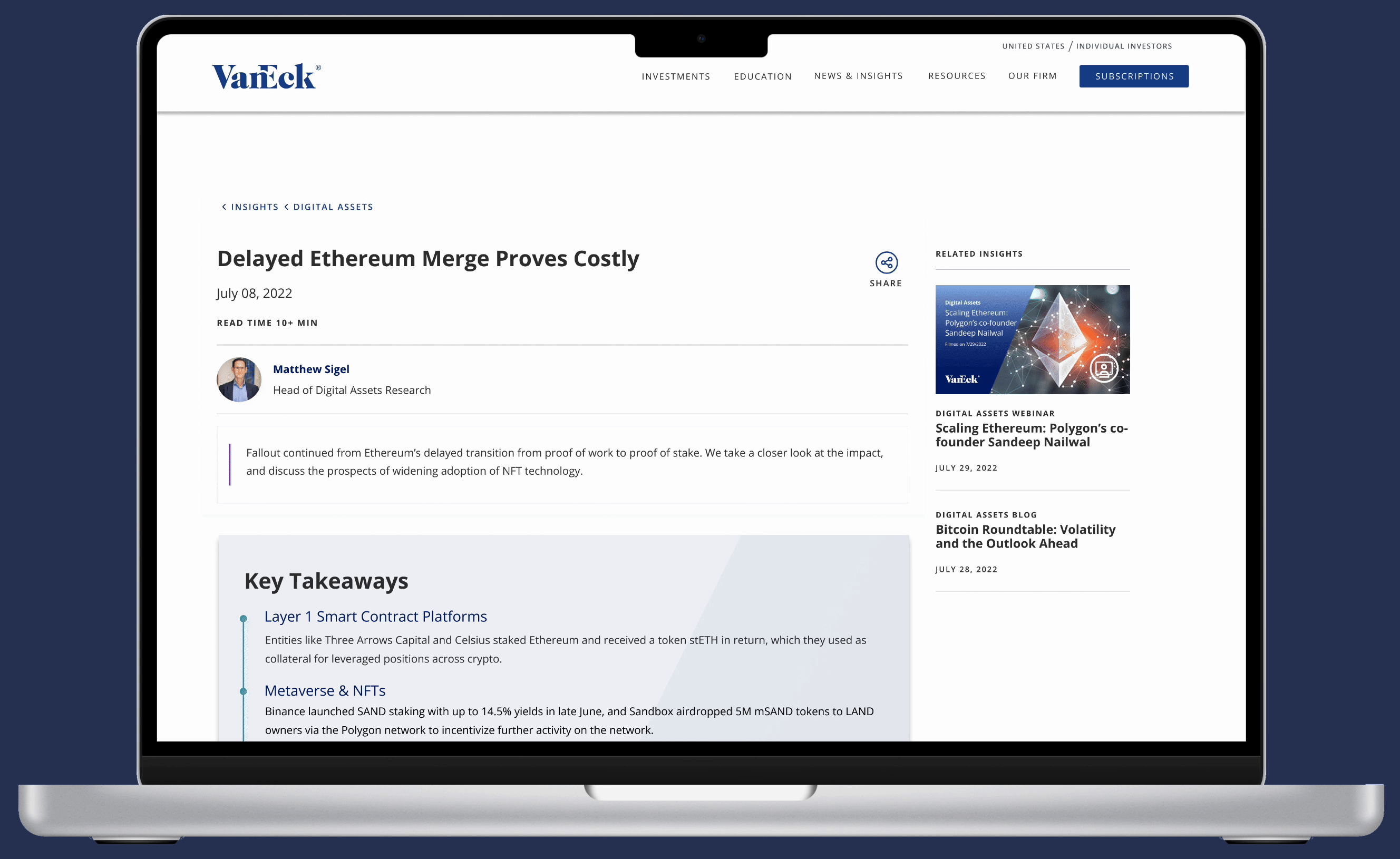
SOCIAL MEDIA
︎︎︎ Enabling social media links in bylines for easy accessibility.
︎︎︎ Diversifying social media content and templates by utlizing a more interactive approach.
︎︎︎ Rebranding and using bold typefaces to make visuals more engaging and eye-catching.


04 REDESIGNING UI
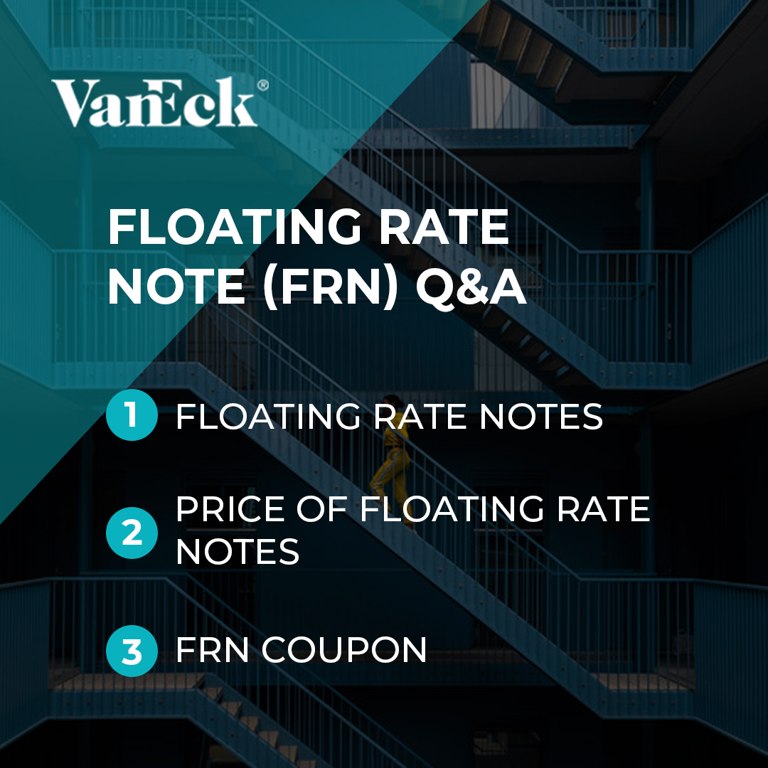
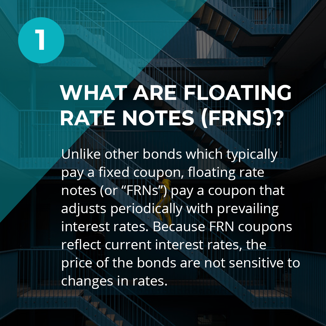
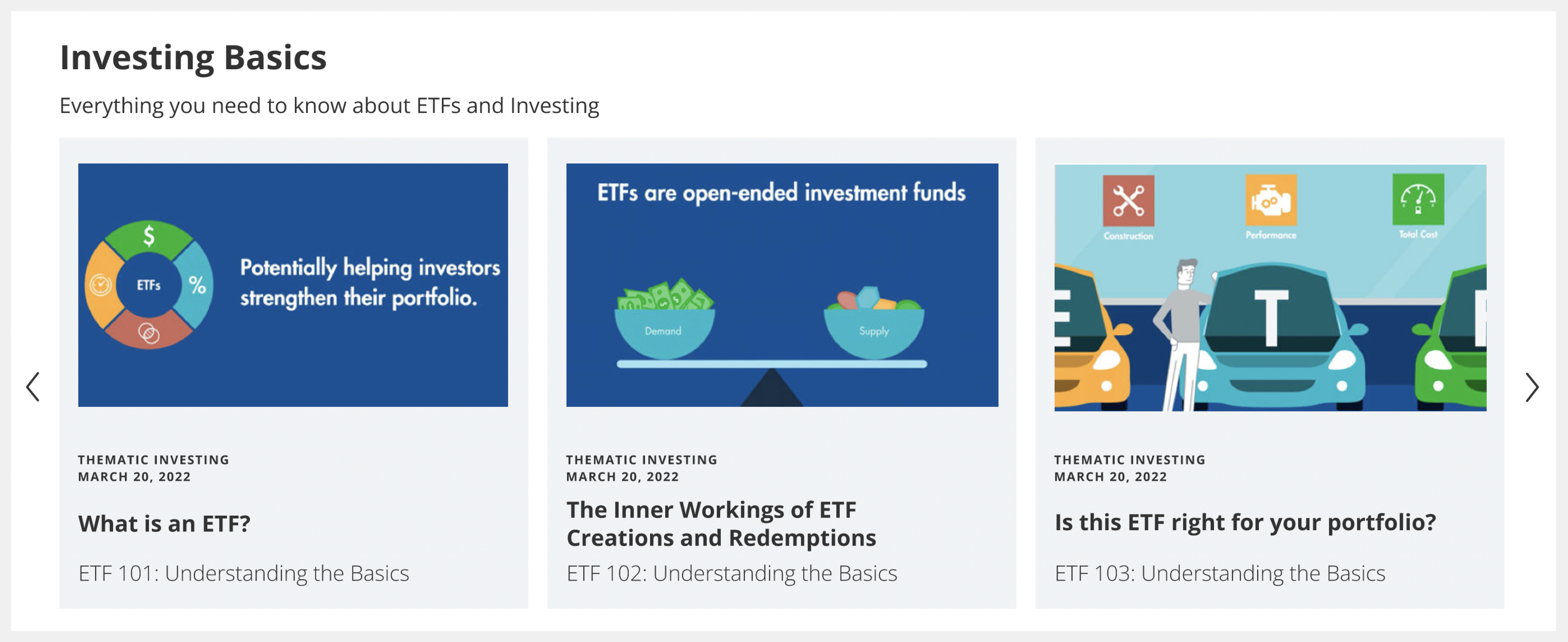
EDUCATION CENTER
︎︎︎ Digestable UX for new visitors and non-seasoned investors.
︎︎︎ Friendly and fun introduction to investing.
︎︎︎ Developing separate channels for various users to create a more personalized web experience.
TRENDS WITH BENEFITS
︎︎︎ Easy accessibility to streaming services.
︎︎︎ Encourages users to pull content from other platforms and promotes the podcast for anyone who is interested in listening directly to Trends with Benefits.
︎︎︎ Bold icons that can be easily identified.

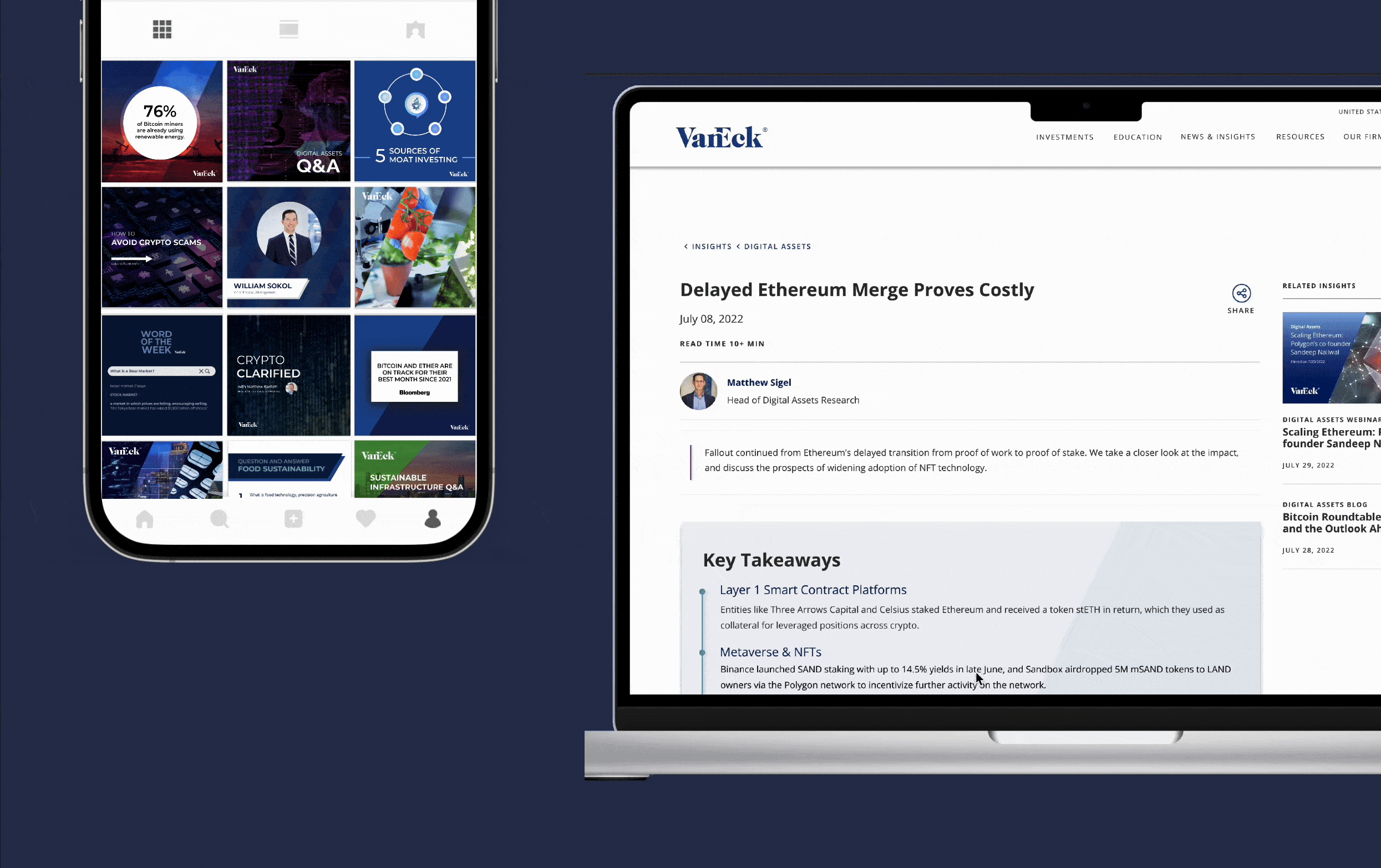
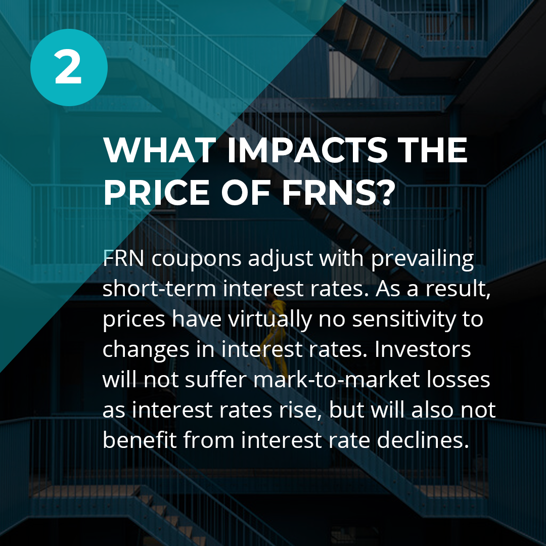
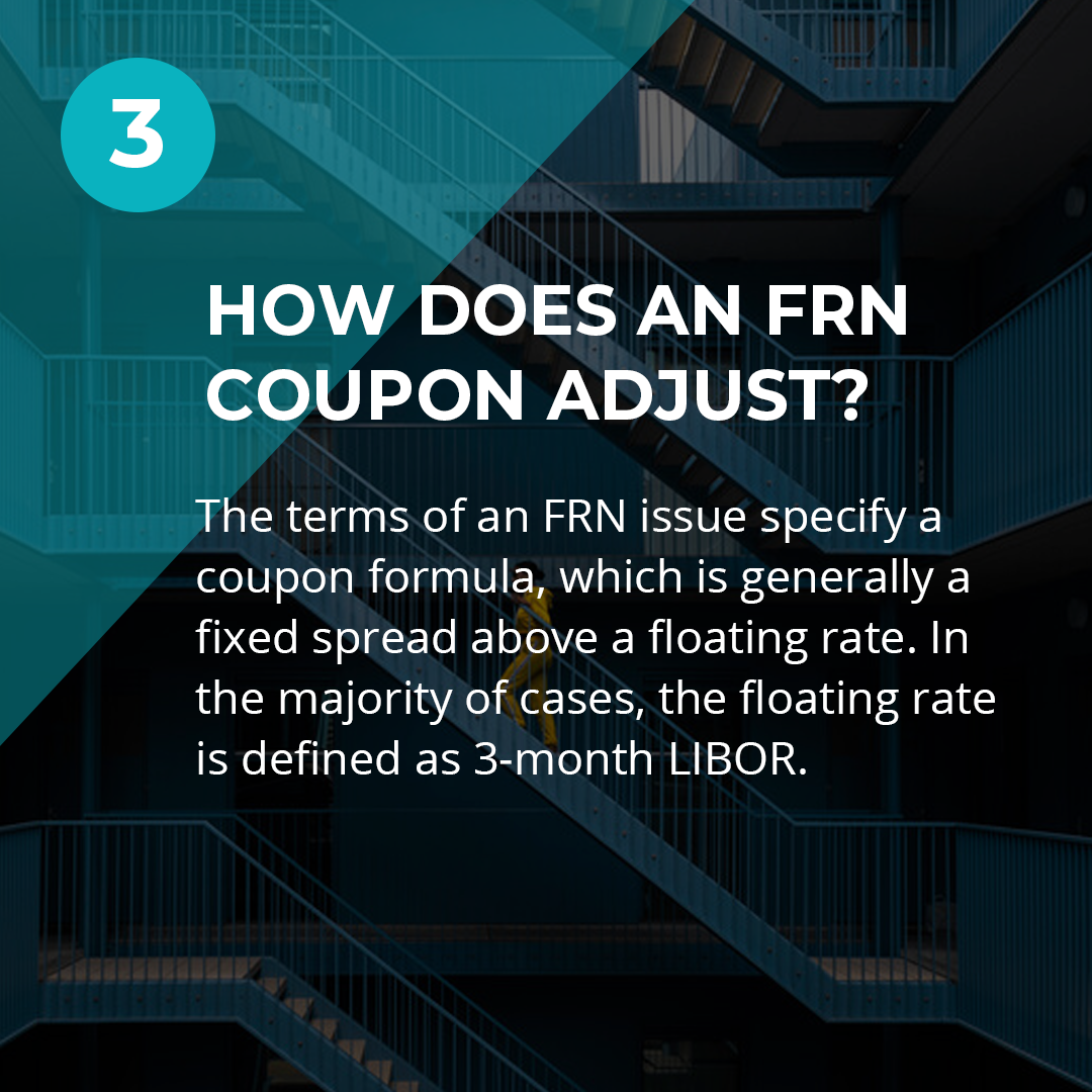
LONG CONTENT BLOGS
︎︎︎ Data showed that long-form content had the highest exit rate, with the lowest average time spent on page.
︎︎︎ Articles with at least one graphic chart had the lowest exit rate and and highest average percentage.
Solution: to break up content and allow user to quickly access information that is relevent to them. Dividing long-form articles into key take-aways to make the information less dense and more digestable. Designing a navigation bar for users to move between the chapterized content seamlessly.
Results: Increased visitors average time spent on page by 90%.
INSURANCE CENTER
The initial design was a static visual of the firms total AUM that required uploading an image to the website.
![]()

The redesign involved building an interactive and dynamic slider that showed the fixed income assets by year.
![]()

05 USER TESTING FEEDBACK
︎︎︎ The average time spent on page increased with the implementation of jump links and key takeaways for long form content.
︎︎︎ Ensuring that content is being pushed to where the users exist, which will pull them back to the VanEck site.
︎︎︎ Information hierarchy and friendly UI for education page made the content more digestable and therefore decreased exit rates on the site.